on
Turning images into ridgeline plots
What if we turn images into ridgeline plots?
Ridgeline plots
“Ridgeline plots are partially overlapping line plots that create the impression of a mountain range. They can be quite useful for visualizing changes in distributions over time or space.” - Claus Wilke.
They have been quite popular recently. Some references include:
- The work of James Cheshire to represent population density
- Alex Whan’s post, reproducing the Joy Division’s album cover
- The ggridges package from Claus Wilke
- In Python, the recent ridge_map library by Colin Carroll finally convinced me to perform some experiments
Import images
First, let’s load the required packages. Then, we create a function to import an image from a url and store the grayscale pixel values as a matrix.
library(data.table)
library(ggplot2)
library(ggridges)
library(jpeg)

img_to_matrix <- function(imgurl) {
  tmp <- tempfile()
  download.file(imgurl, tmp, mode = "wb")
  img <- readJPEG(tmp)
  file.remove(tmp)
  img <- t(apply(img, 2, rev)) # rotate
  print(paste("Image loaded.", nrow(img), "x", ncol(img), "pixels."))
  img
}
We’ll use two images throughout this post.
url1 <- "http://upload.wikimedia.org/wikipedia/en/8/86/Einstein_tongue.jpg"
url2 <- "http://upload.wikimedia.org/wikipedia/commons/thumb/3/3b/Monroe_1953_publicity.jpg/391px-Monroe_1953_publicity.jpg"

img1 <- img_to_matrix(url1)
## [1] "Image loaded. 230 x 286 pixels."img2 <- img_to_matrix(url2)## [1] "Image loaded. 391 x 480 pixels."par(mfrow = c(1, 2))
image(img1, col = gray.colors(50))
image(img2, col = gray.colors(50))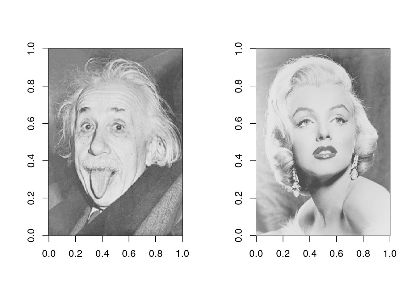
Convert image to a data.frame
Next, the matrix_to_dt function will convert an image matrix into a data.frame. The data.table package is used here for convenience.
This function is simply used to melt the matrix. The coordinates on the y axis that are used below (y2) correspond to the y value + the pixel intensity (z).
This function has four parameters:
img: the matrix object
ratio: integer value, used to reduce the size of the matrix
height: numeric value, scaling applied to pixel value, higher will make peaks taller (and create overlap)
y_as_factor: boolean, will make things easier with ggplot2geom_ribbon()
matrix_to_dt <- function(img, ratio = NULL, height = 3, y_as_factor = FALSE) {
  if (!is.null(ratio)) {
    img <- img[seq(1, nrow(img), by = ratio),
               seq(1, ncol(img), by = ratio)]
  }

  imgdt <- data.table(x = rep(1:nrow(img), ncol(img)),
                      y = rep(1:ncol(img), each = nrow(img)),
                      z = as.numeric(img))

  imgdt[, y2 := y + z * height]

  if (y_as_factor) {
    imgdt[, y := factor(y, levels = max(y):1)]
    setorder(imgdt, -y)
  }

  imgdt[]
}
Basic plots
Starting with a simple ggplot2 plot, using geom_path().
imgdt <- matrix_to_dt(img1, ratio = 2L)

ggplot(data = imgdt) +
  geom_path(aes(x     = x,
                y     = y2,
                group = y),
            size = 0.15) +
  theme_void()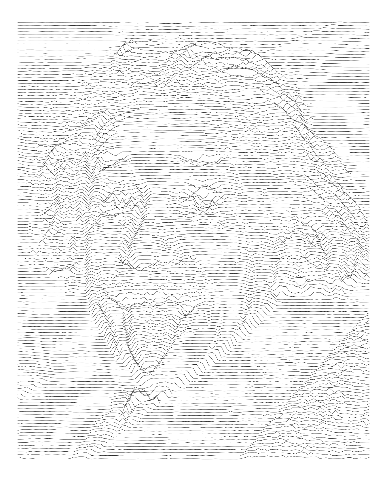
Here is another try increasing the height.
imgdt <- matrix_to_dt(img1, height = 5L, ratio = 2L)

ggplot(data = imgdt) +
  geom_path(aes(x     = x,
                y     = y2,
                group = y),
            size = 0.2) +
  theme_void()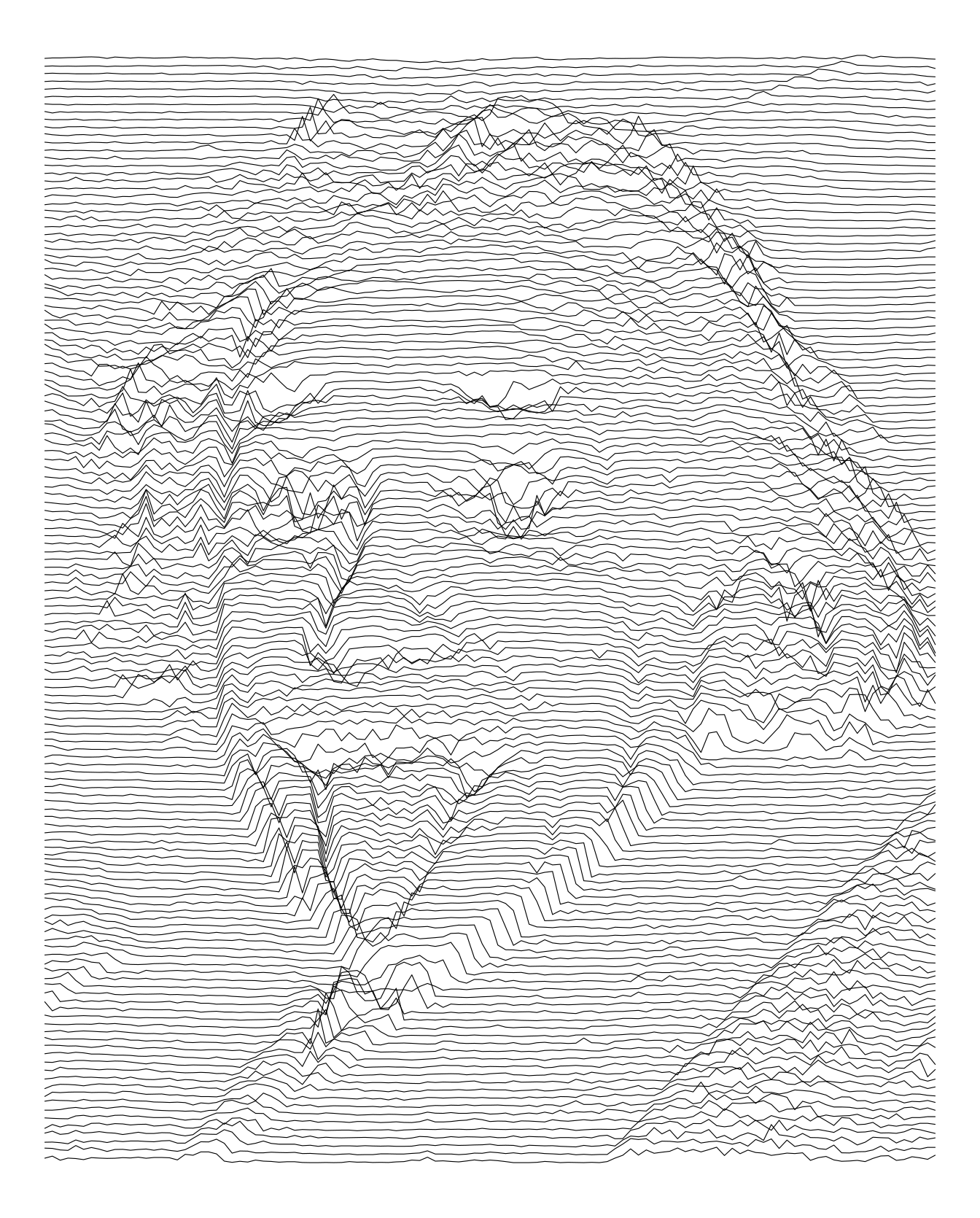
imgdt <- matrix_to_dt(img2, height = 5L, ratio = 4L)

ggplot(data = imgdt) +
  geom_path(aes(x     = x,
                y     = y2,
                group = y),
            size = 0.2) +
  theme_void()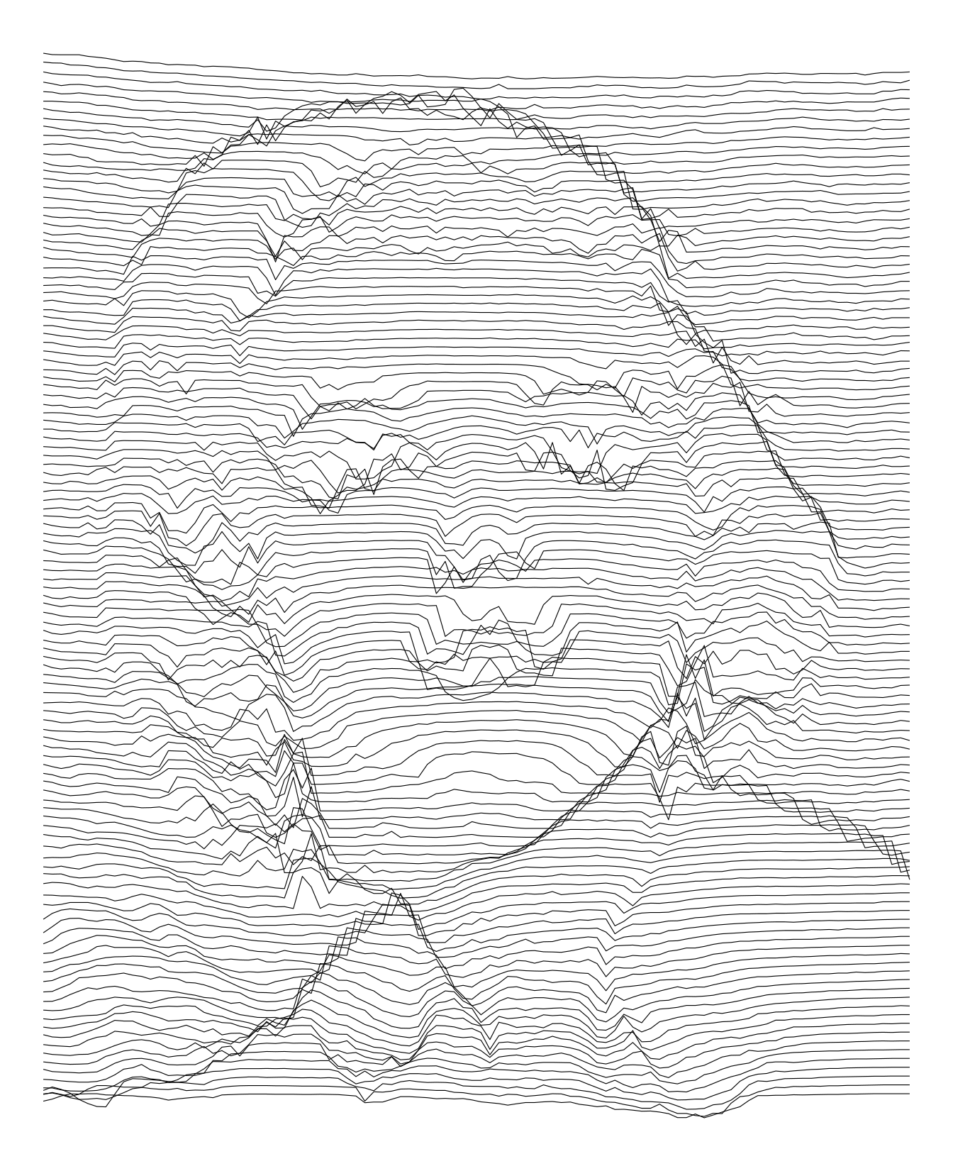
We can also used vertical lines. In fact, I think they are more appropriate for these pictures.
imgdt <- matrix_to_dt(img1, height = 5L, ratio = 2L)

ggplot(data = imgdt) +
  geom_path(aes(x     = x + z * 5L,
                y     = y,
                group = x),
            size   = 0.15) +
  theme_void()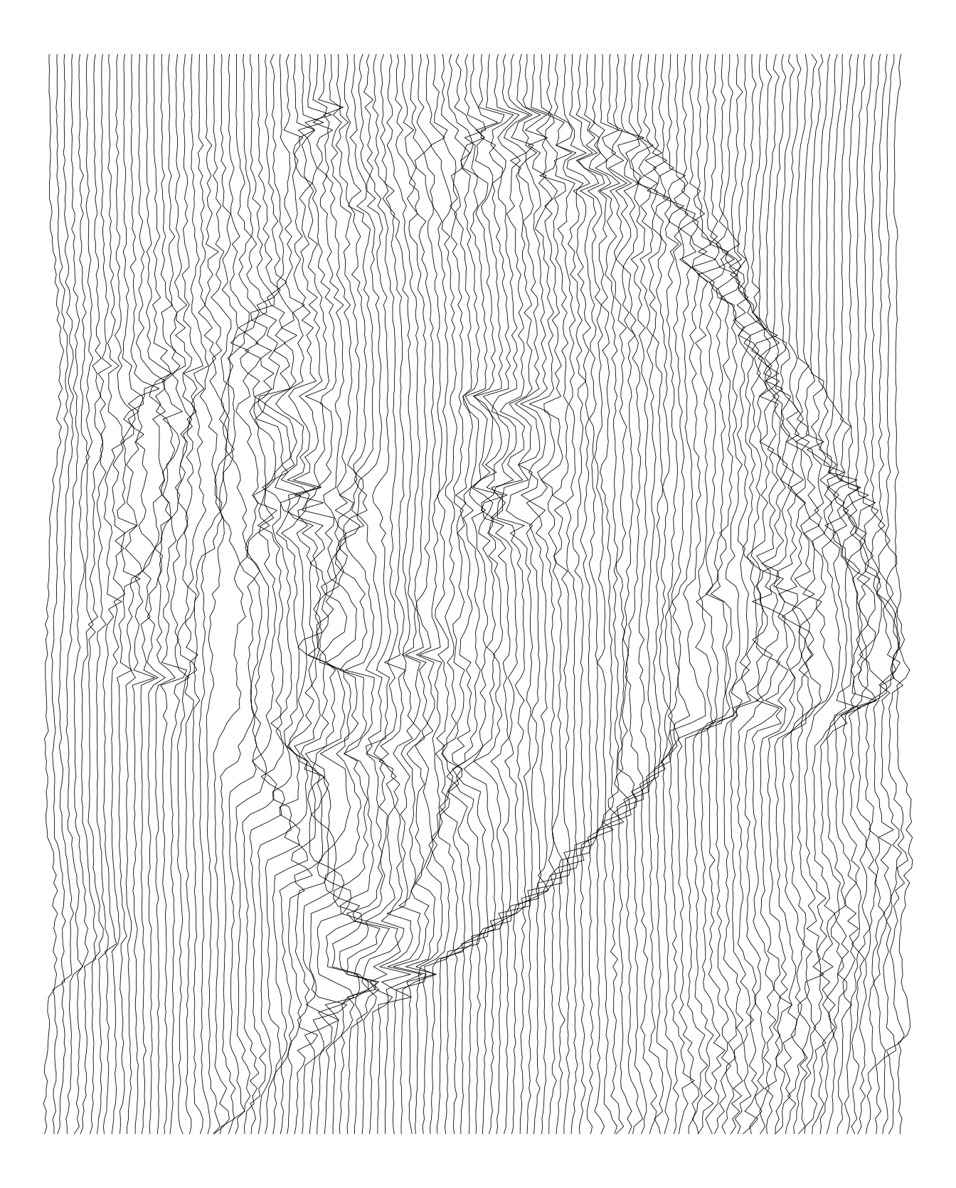
imgdt <- matrix_to_dt(img2, height = 5L, ratio = 3L)

ggplot(data = imgdt) +
  geom_path(aes(x      = x + z * 4L,
                y      = y,
                group  = x,
                colour = x),
            size = 0.2) +
  scale_colour_continuous(type = "viridis", guide = FALSE) +
  theme_void()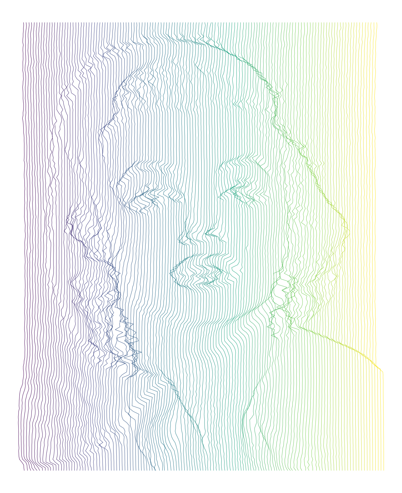
Ribbon plots
To prevent the lines from overlapping, we can use geom_ribbon. The y values are converted into factors to keep them in the right order.
imgdt <- matrix_to_dt(img1, height = 5L, y_as_factor = TRUE, ratio = 2L)

ggplot(data = imgdt) +
  geom_ribbon(aes(x     = x,
                  ymax  = y2,
                  ymin  = 0,
                  group = y),
              size   = 0.15,
              colour = "white",
              fill   = "black") +
  theme_void()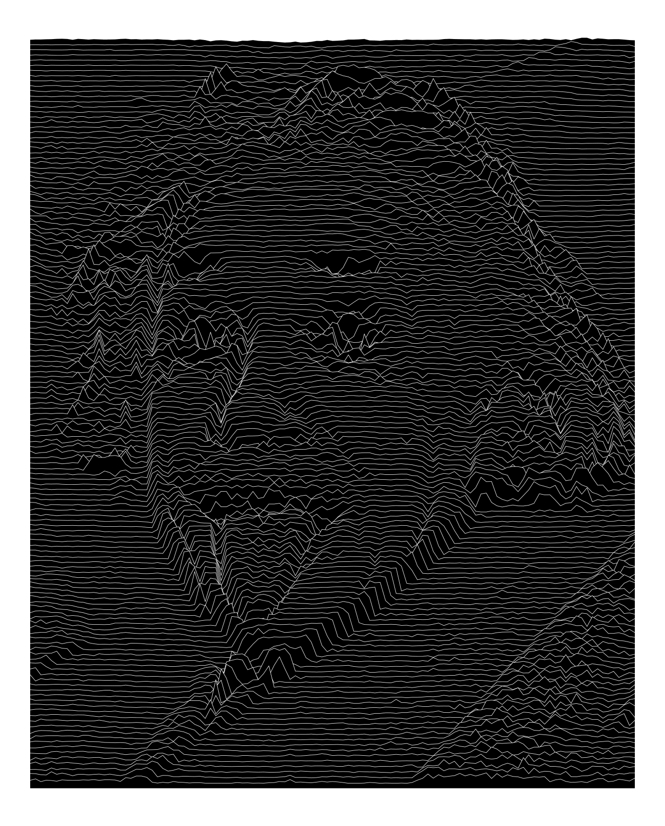
imgdt <- matrix_to_dt(img2, height = 7L, y_as_factor = TRUE, ratio = 4L)

ggplot(data = imgdt) +
  geom_ribbon(aes(x     = x,
                  ymax  = y2,
                  ymin  = 0,
                  group = y),
              size   = 0.15,
              colour = "white",
              fill   = "black") +
  theme_void()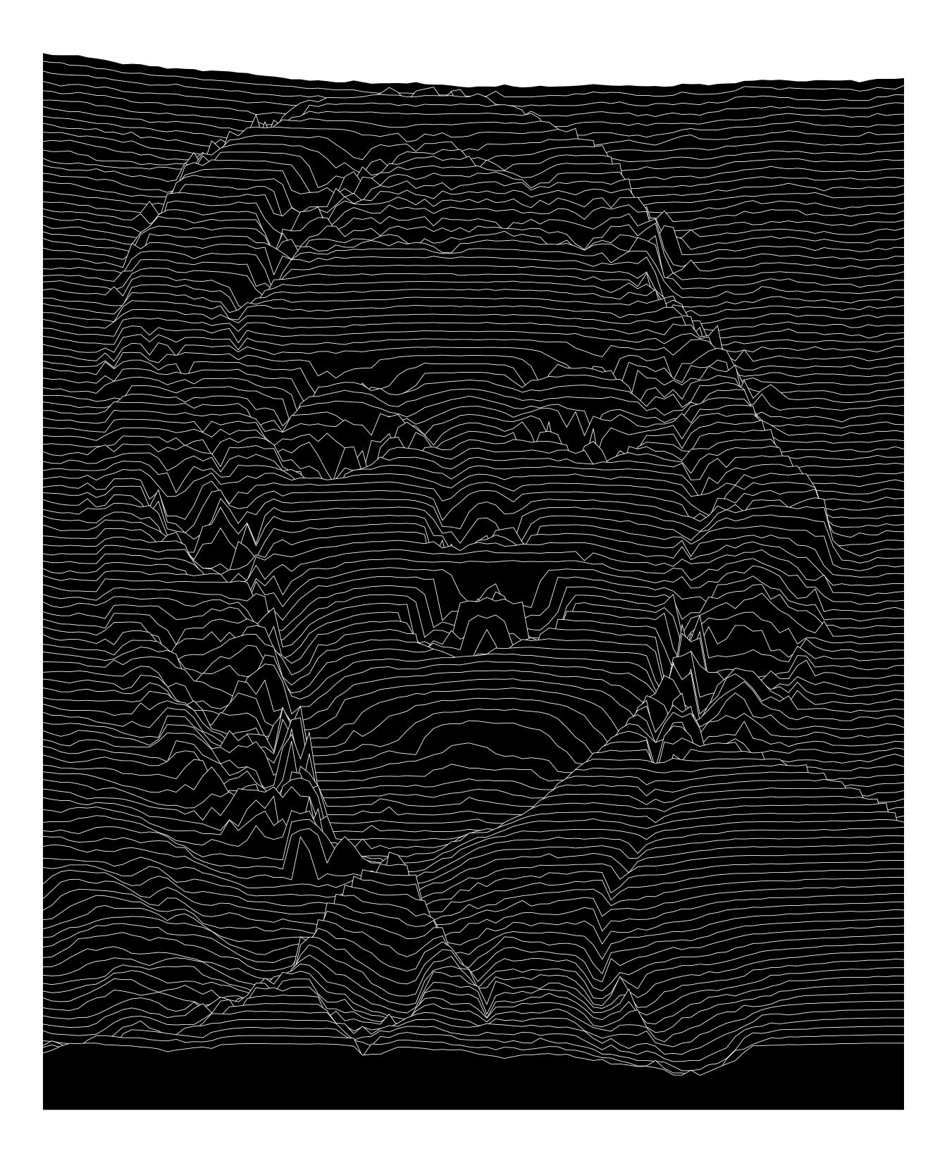
ggridges
The plots above are a bit sharp and lack the smooth aspect of ridgeline plots.
A first solution could be to use a smoothing spline. As an alternative, I gave a try to ggridges. The trick here is to transform the data by repeating the x values proportionally to the pixel intensity.
imgdt <- matrix_to_dt(img1, height = 7L, y_as_factor = TRUE, ratio = 2L)

imgdt2 <- imgdt[, .(x = rep(x, round(z * 100))), by = y]
imgdt2[, y := factor(y, levels = rev(levels(y)))]

ggplot(imgdt2,
       aes(x = x,
           y = y)) +
  stat_density_ridges(geom      = "density_ridges",
                      bandwidth = 0.8,
                      colour    = "white",
                      fill      = "black",
                      scale     = 7,
                      size      = 0.15) +
  theme_ridges() +
  theme_void() +
theme(panel.background = element_rect(fill = 'black')) 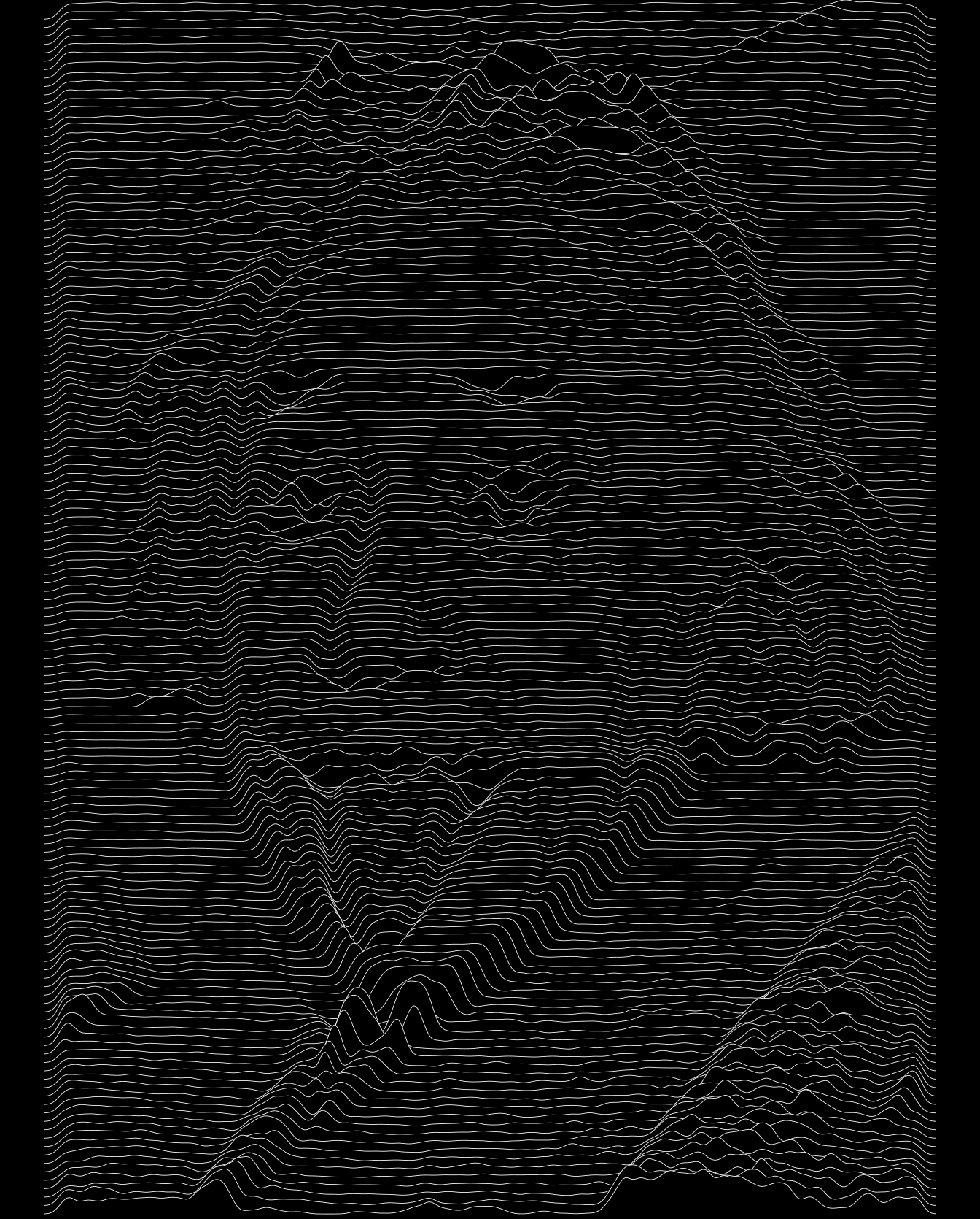
imgdt <- matrix_to_dt(img2, height = 7L, y_as_factor = TRUE, ratio = 4L)

imgdt2 <- imgdt[, .(x = rep(x, round(z * 100))), by = y]
imgdt2[, y := factor(y, levels = rev(levels(y)))]

ggplot(imgdt2,
       aes(x = x,
           y = y)) +
  stat_density_ridges(geom      = "density_ridges",
                      bandwidth = 0.8,
                      colour    = "white",
                      fill      = "black",
                      scale     = 5,
                      size      = 0.2,
                      rel_min_height = 0.15) +
  theme_ridges() +
  theme_void() +
  theme(panel.background = element_rect(fill = 'black'))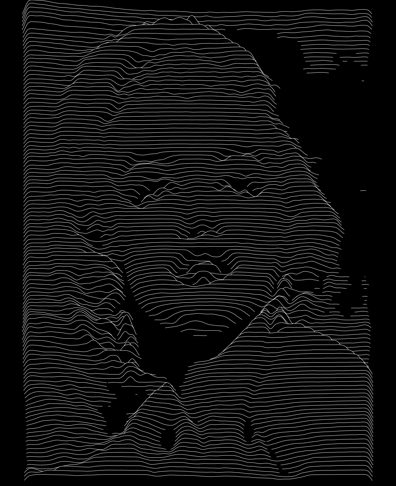
ggplot(imgdt2,
       aes(x = x,
           y = y)) +
  stat_density_ridges(geom      = "density_ridges",
                      bandwidth = 0.8,
                      alpha     = 1,
                      size      = 0.01,
                      fill      = "white",
                      color     = NA,
                      rel_min_height = 0.15) +
  theme_ridges() +
  theme_void() +
  theme(panel.background = element_rect(fill = 'black'))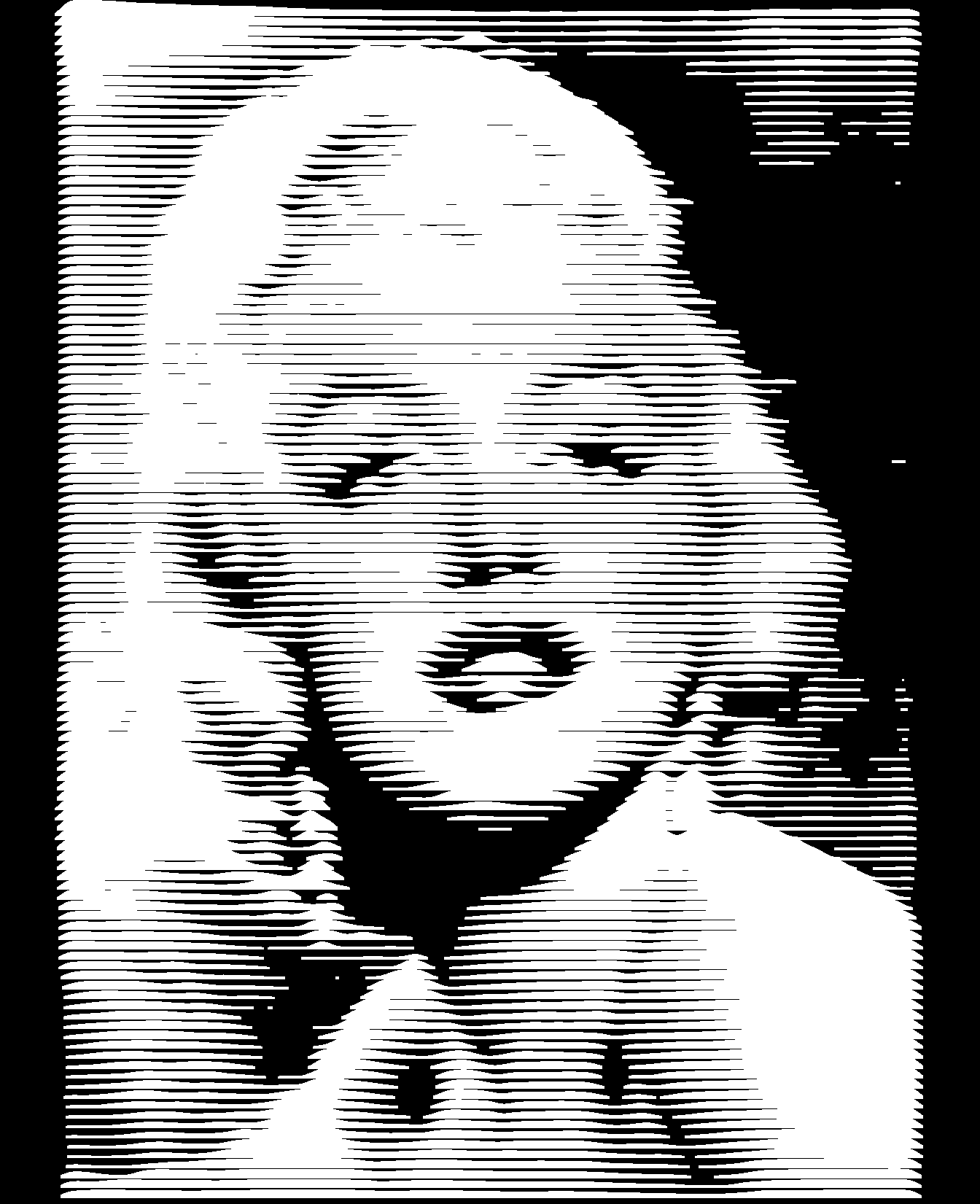
Conclusion
Zooming in and out the high-resolution plots rendered as a pdf file is mesmerizing and it is quite impressive to see the amount of details captured by these few intertwining lines.
Here is a final example.
jpeg("tmp.jpg")
plot(0, 0, type = "n", axes = FALSE, xlab = "", ylab = "")
text(0, 0, "ggplot2\nrocks!", cex = 9)
dev.off()
## png
## 2img <- readJPEG("tmp.jpg")
img <- 1 - t(apply(img[, , 1], 2, rev))
imgdt <- matrix_to_dt(img, height = 4L, y_as_factor = TRUE, ratio = 3L)
file.remove("tmp.jpg")## [1] TRUEggplot(imgdt) +
geom_ribbon(aes(x = x,
ymax = y2,
ymin = 0,
group = y,
colour = y),
size = 0.6,
fill = "white") +
theme_void() +
scale_colour_discrete(guide = FALSE)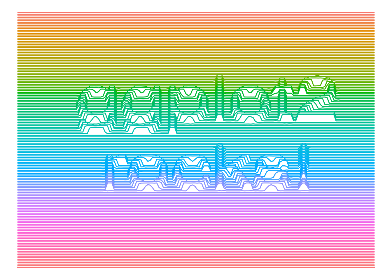
sessionInfo()## R version 3.6.3 (2020-02-29)
## Platform: x86_64-pc-linux-gnu (64-bit)
## Running under: Ubuntu 18.04.4 LTS
##
## Matrix products: default
## BLAS: /usr/lib/x86_64-linux-gnu/blas/libblas.so.3.7.1
## LAPACK: /usr/lib/x86_64-linux-gnu/lapack/liblapack.so.3.7.1
##
## locale:
## [1] LC_CTYPE=en_US.UTF-8 LC_NUMERIC=C
## [3] LC_TIME=fr_FR.UTF-8 LC_COLLATE=en_US.UTF-8
## [5] LC_MONETARY=fr_FR.UTF-8 LC_MESSAGES=en_US.UTF-8
## [7] LC_PAPER=fr_FR.UTF-8 LC_NAME=C
## [9] LC_ADDRESS=C LC_TELEPHONE=C
## [11] LC_MEASUREMENT=fr_FR.UTF-8 LC_IDENTIFICATION=C
##
## attached base packages:
## [1] stats graphics grDevices utils datasets methods base
##
## other attached packages:
## [1] jpeg_0.1-8.1 ggridges_0.5.2 ggplot2_3.3.1 data.table_1.13.0
##
## loaded via a namespace (and not attached):
## [1] Rcpp_1.0.3 pillar_1.4.3 compiler_3.6.3 plyr_1.8.5
## [5] tools_3.6.3 digest_0.6.23 viridisLite_0.3.0 evaluate_0.14
## [9] lifecycle_0.2.0 tibble_2.1.3 gtable_0.3.0 pkgconfig_2.0.3
## [13] rlang_0.4.6 yaml_2.2.0 blogdown_0.17 xfun_0.11
## [17] withr_2.1.2 stringr_1.4.0 dplyr_1.0.0 knitr_1.26
## [21] generics_0.0.2 vctrs_0.3.1 grid_3.6.3 tidyselect_1.1.0
## [25] glue_1.4.1 R6_2.4.1 rmarkdown_2.0 bookdown_0.16
## [29] purrr_0.3.3 farver_2.0.1 magrittr_1.5 scales_1.1.0
## [33] htmltools_0.4.0 colorspace_1.4-1 labeling_0.3 stringi_1.4.3
## [37] munsell_0.5.0 crayon_1.3.4