on
Dendrograms in R, a lightweight approach
Dendrograms in R
Dendrograms are diagrams useful to illustrate hierarchical relationships, such as those obtained from a hierarchical clustering. They are commonly used in biology, especially in genetics, for example to illustrate the relationships among a set of genes or taxa.
Several alternatives exist in R to visualize dendrograms (reviews here and here), like base R of course, or the ape package. For ggplot2-based solutions, let’s mention ggdendro, dendextend, or ggtree.
ggdendro is stable, lightweight (no dependency other than MASS and ggplot2), and allows to access cluster data in a convenient format, but its functionalities are a bit limited in terms of visualization. On the other hand, dendextend and ggtree offer a lot of great features, but at the cost of higher dependency requirements and a steeper learning curve to use them effectively.
I wanted a “lightweight” and flexible ggplot2-based solution to draw dendrograms, in particular with the possibility to highlight clusters using different branch colors.
Inspired by this stackoverflow question, I finally ended up writing the functions described below, using ggdendro and ggplot2 only.
library(ggdendro)
library(ggplot2)
Tweaking ggdendro
As a first step, I have ‘extended’ ggdendro::dendro_data(). The dendro_data_k() function takes a k argument, an integer, specifying the number of desired clusters. This value is simply used in the base::cutree() function, and, for each cluster, the segments are assigned the cluster id of the corresponding leaves based on their x, xend, and yend coordinates. This may not be the most elegant way, but it is quite straightforward.
dendro_data_k <- function(hc, k) {

  hcdata    <-  ggdendro::dendro_data(hc, type = "rectangle")
  seg       <-  hcdata$segments
  labclust  <-  cutree(hc, k)[hc$order]
  segclust  <-  rep(0L, nrow(seg))
  heights   <-  sort(hc$height, decreasing = TRUE)
  height    <-  mean(c(heights[k], heights[k - 1L]), na.rm = TRUE)

  for (i in 1:k) {
    xi      <-  hcdata$labels$x[labclust == i]
    idx1    <-  seg$x    >= min(xi) & seg$x    <= max(xi)
    idx2    <-  seg$xend >= min(xi) & seg$xend <= max(xi)
    idx3    <-  seg$yend < height
    idx     <-  idx1 & idx2 & idx3
    segclust[idx] <- i
  }

  idx                    <-  which(segclust == 0L)
  segclust[idx]          <-  segclust[idx + 1L]
  hcdata$segments$clust  <-  segclust
  hcdata$segments$line   <-  as.integer(segclust < 1L)
  hcdata$labels$clust    <-  labclust

  hcdata
}
Plot functions
With the convenient data structure obtained from ggdendro and the function above, the tree can be built using ggplot2. Two geoms are used: geom_segment() for the branches, and geom_text() for the labels.
Things become a bit more complicated if we want to customize the orientation of the tree (for example top to bottom or left to right) or the format (circular plot). To deal with that more easily, a distinct function is used (internally) to set the parameters of the labels (angle, offset, …).
set_labels_params <- function(nbLabels,
                              direction = c("tb", "bt", "lr", "rl"),
                              fan       = FALSE) {
  if (fan) {
    angle       <-  360 / nbLabels * 1:nbLabels + 90
    idx         <-  angle >= 90 & angle <= 270
    angle[idx]  <-  angle[idx] + 180
    hjust       <-  rep(0, nbLabels)
    hjust[idx]  <-  1
  } else {
    angle       <-  rep(0, nbLabels)
    hjust       <-  0
    if (direction %in% c("tb", "bt")) { angle <- angle + 45 }
    if (direction %in% c("tb", "rl")) { hjust <- 1 }
  }
  list(angle = angle, hjust = hjust, vjust = 0.5)
}
plot_ggdendro <- function(hcdata,
direction = c("lr", "rl", "tb", "bt"),
fan = FALSE,
scale.color = NULL,
branch.size = 1,
label.size = 3,
nudge.label = 0.01,
expand.y = 0.1) {
direction <- match.arg(direction) # if fan = FALSE
ybreaks <- pretty(segment(hcdata)$y, n = 5)
ymax <- max(segment(hcdata)$y)
## branches
p <- ggplot() +
geom_segment(data = segment(hcdata),
aes(x = x,
y = y,
xend = xend,
yend = yend,
linetype = factor(line),
colour = factor(clust)),
lineend = "round",
show.legend = FALSE,
size = branch.size)
## orientation
if (fan) {
p <- p +
coord_polar(direction = -1) +
scale_x_continuous(breaks = NULL,
limits = c(0, nrow(label(hcdata)))) +
scale_y_reverse(breaks = ybreaks)
} else {
p <- p + scale_x_continuous(breaks = NULL)
if (direction %in% c("rl", "lr")) {
p <- p + coord_flip()
}
if (direction %in% c("bt", "lr")) {
p <- p + scale_y_reverse(breaks = ybreaks)
} else {
p <- p + scale_y_continuous(breaks = ybreaks)
nudge.label <- -(nudge.label)
}
}
# labels
labelParams <- set_labels_params(nrow(hcdata$labels), direction, fan)
hcdata$labels$angle <- labelParams$angle
p <- p +
geom_text(data = label(hcdata),
aes(x = x,
y = y,
label = label,
colour = factor(clust),
angle = angle),
vjust = labelParams$vjust,
hjust = labelParams$hjust,
nudge_y = ymax * nudge.label,
size = label.size,
show.legend = FALSE)
# colors and limits
if (!is.null(scale.color)) {
p <- p + scale_color_manual(values = scale.color)
}
ylim <- -round(ymax * expand.y, 1)
p <- p + expand_limits(y = ylim)
p
}Basic dendrogram
We are now ready to build a dendrogram. By default, the standard ggplot2 theme is applied.
mtc <- scale(mtcars)
D   <- dist(mtc)
hc  <- hclust(D)

hcdata <- dendro_data_k(hc, 3)

p <- plot_ggdendro(hcdata,
                   direction   = "lr",
                   expand.y    = 0.2)
p
Customized dendrograms
We can further customize the dendrogram, by ajusting the plot_ggdendro() parameters, or adding additional properties. Below is an example with ggplot2::theme_void().
cols <- c("#a9a9a9", "#1f77b4", "#ff7f0e", "#2ca02c")

p <- plot_ggdendro(hcdata,
                   direction   = "tb",
                   scale.color = cols,
                   label.size  = 2.5,
                   branch.size = 0.5,
                   expand.y    = 0.2)

p <- p + theme_void() + expand_limits(x = c(-1, 32))
p
Here is another example adding custom theme elements.
mytheme <- theme(axis.text          = element_text(color = "#50505030"),
                 panel.grid.major.y = element_line(color = "#50505030",
                                                   size  = 0.25))
p + mytheme
Finally, let’s do a fan dendrogram.
p <- plot_ggdendro(hcdata,
                   fan         = TRUE,
                   scale.color = cols,
                   label.size  = 4,
                   nudge.label = 0.02,
                   expand.y    = 0.4)

mytheme <- theme(panel.background = element_rect(fill = "black"))

p + theme_void() + mytheme
Further customization
Besides the graphical properties, it is also possible to add other geom elements, making the possibilities endless.
p <- plot_ggdendro(hcdata,
                   fan         = TRUE,
                   scale.color = cols,
                   label.size  = 4,
                   nudge.label = 0.15,
                   expand.y    = 0.8)

mytheme <- theme(panel.background = element_rect(fill = "black"))

p <- p + theme_void() + mytheme

p + geom_point(data     = mtcars,
               aes(x    = match(rownames(mtcars), hcdata$labels$label),
                   y    = -0.7,
                   fill = as.factor(cyl)),
               size     = 5,
               shape    = 21,
               show.legend = FALSE) +
  scale_fill_manual(values = c("white", "yellow", "red")) +
  geom_text(data      = mtcars,
            aes(x     = match(rownames(mtcars), hcdata$labels$label),
                y     = -0.7,
                label = cyl),
            size = 3)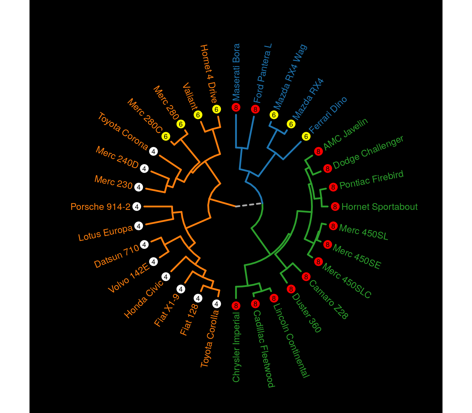
Combining multiple plots, with gridExtra for example, we can easily make tanglegrams.
library(gridExtra)

mtc     <- scale(mtcars)
D       <- dist(mtc)
hc1     <- hclust(D, "average")
hc2     <- hclust(D, "ward.D2")
hcdata1 <- dendro_data_k(hc1, 5)
hcdata2 <- dendro_data_k(hc2, 5)
cols    <- c("#a9a9a9", "#1f77b4", "#ff7f0e", "#2ca02c", "#d62728", "#9467bd")

p1 <- plot_ggdendro(hcdata1,
                    direction   = "lr",
                    scale.color = cols,
                    expand.y    = 0.2) +
  theme_void()

p2 <- plot_ggdendro(hcdata2,
                    direction   = "rl",
                    scale.color = cols,
                    expand.y    = 0.2) +
  theme_void()

idx <- data.frame(y1 = 1:nrow(hcdata1$labels),
                  y2 = match(hcdata1$labels$label, hcdata2$labels$label))

p3 <- ggplot() +
  geom_segment(data     = idx,
               aes(x    = 0,
                   y    = y1,
                   xend = 1,
                   yend = y2),
               color    = "grey") +
  theme_void()

grid.arrange(p1, p3, p2, ncol = 3, widths = c(2, 1, 2))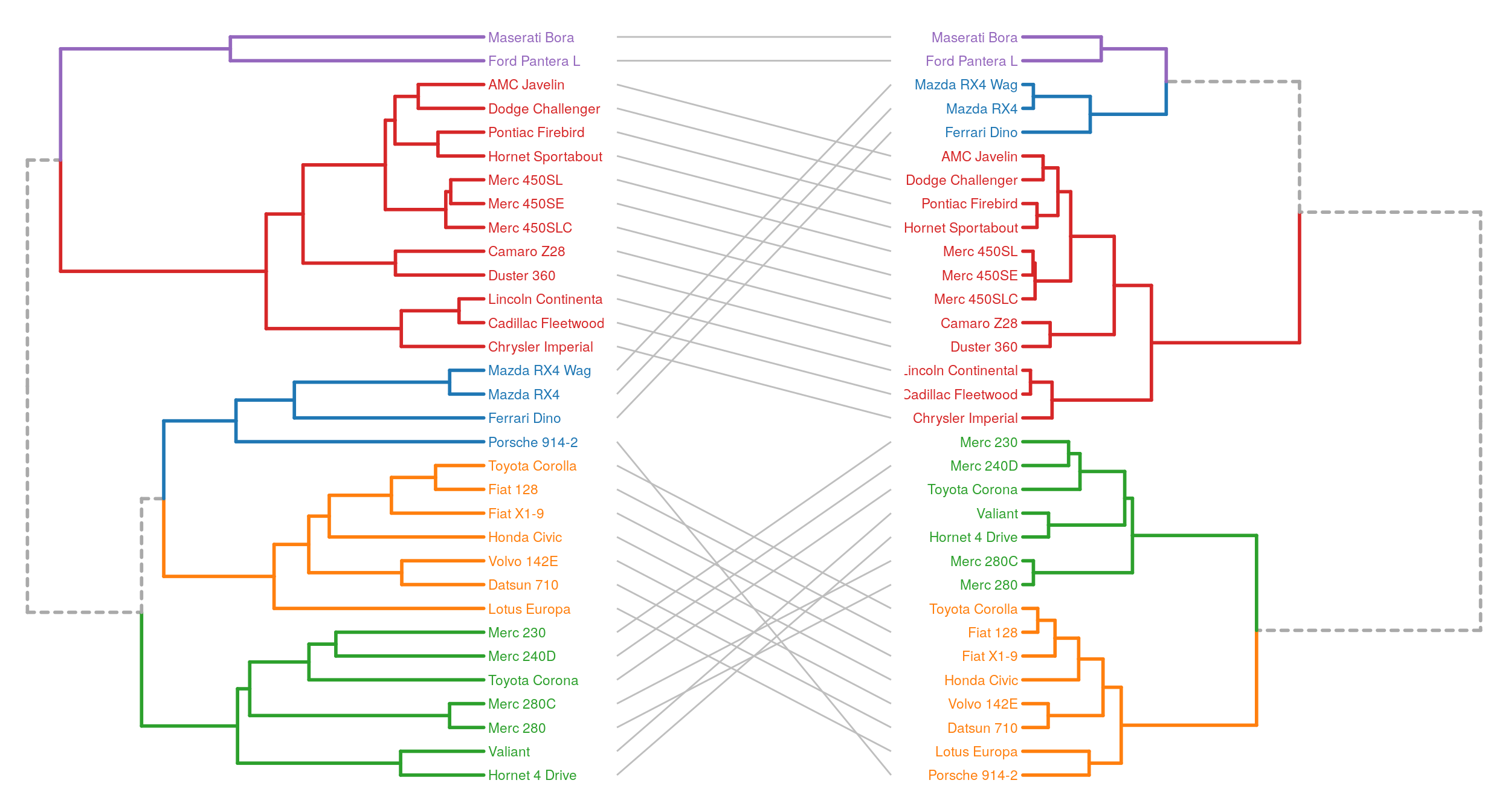
A last example, with a dendrogram and a ‘kind of bubblemap’. I think adding a size encoding helps to better get the structure of the data compared to a standard heatmap. In the mtcars dataset, the variables have different units, but here, the goal is simply to highlight low or high values.
library(data.table)

mtc    <- scale(mtcars)
D      <- dist(mtc)
hc     <- hclust(D)
hcdata <- dendro_data_k(hc, 3)

p1 <- plot_ggdendro(hcdata,
                    direction   = "lr",
                    scale.color = cols,
                    expand.y    = 0.15) +
  theme(axis.text.x      = element_text(color = "#ffffff"),
        panel.background = element_rect(fill  = "#ffffff"),
        axis.ticks       = element_blank()) +
  scale_color_brewer(palette = "Set1") +
  xlab(NULL) +
  ylab(NULL)

# scale from 0 to 1 and reshape mtcars data
scaled <- setDT(lapply(mtcars, scales::rescale))
melted <- melt(scaled, measure.vars = colnames(mtcars))
melted[, variable := as.factor(variable)]
idx    <- match(rownames(mtcars), hcdata$labels$label)
melted[, car := rep(idx, ncol(mtcars))]

# 'bubblemap'
p2 <- ggplot(melted) +
  geom_point(aes(x      = variable,
                 y      = car,
                 size   = value,
                 color  = value),
             show.legend = FALSE) +
  scale_color_viridis_c(direction = -1) +
  theme_minimal() +
  theme(axis.text.y = element_blank()) +
  xlab(NULL) +
  ylab(NULL)

grid.arrange(p1, p2, ncol = 2, widths = 3:2)
Conclusion
R packages like ggtree or dendextend are great for out-of-the-box fancy dendrograms. With about 120 lines of code and three functions, the approach described in this article is really basic, but it is also flexible. Customizing the theme parameters and combining the dendrogram with other plot elements, it is quite easy to build more complex visualizations.
sessionInfo()## R version 3.6.3 (2020-02-29)
## Platform: x86_64-pc-linux-gnu (64-bit)
## Running under: Ubuntu 18.04.4 LTS
##
## Matrix products: default
## BLAS: /usr/lib/x86_64-linux-gnu/blas/libblas.so.3.7.1
## LAPACK: /usr/lib/x86_64-linux-gnu/lapack/liblapack.so.3.7.1
##
## locale:
## [1] LC_CTYPE=en_US.UTF-8 LC_NUMERIC=C
## [3] LC_TIME=fr_FR.UTF-8 LC_COLLATE=en_US.UTF-8
## [5] LC_MONETARY=fr_FR.UTF-8 LC_MESSAGES=en_US.UTF-8
## [7] LC_PAPER=fr_FR.UTF-8 LC_NAME=C
## [9] LC_ADDRESS=C LC_TELEPHONE=C
## [11] LC_MEASUREMENT=fr_FR.UTF-8 LC_IDENTIFICATION=C
##
## attached base packages:
## [1] stats graphics grDevices utils datasets methods base
##
## other attached packages:
## [1] data.table_1.13.0 gridExtra_2.3 ggplot2_3.3.1 ggdendro_0.1-20
##
## loaded via a namespace (and not attached):
## [1] Rcpp_1.0.3 RColorBrewer_1.1-2 pillar_1.4.3 compiler_3.6.3
## [5] tools_3.6.3 digest_0.6.23 viridisLite_0.3.0 evaluate_0.14
## [9] lifecycle_0.2.0 tibble_2.1.3 gtable_0.3.0 pkgconfig_2.0.3
## [13] rlang_0.4.6 yaml_2.2.0 blogdown_0.17 xfun_0.11
## [17] withr_2.1.2 stringr_1.4.0 dplyr_1.0.0 knitr_1.26
## [21] generics_0.0.2 vctrs_0.3.1 grid_3.6.3 tidyselect_1.1.0
## [25] glue_1.4.1 R6_2.4.1 rmarkdown_2.0 bookdown_0.16
## [29] purrr_0.3.3 farver_2.0.1 magrittr_1.5 scales_1.1.0
## [33] htmltools_0.4.0 MASS_7.3-51.6 colorspace_1.4-1 labeling_0.3
## [37] stringi_1.4.3 munsell_0.5.0 crayon_1.3.4